
A Signature Reimagined: TheStory Behind Our Logo
A logo is more than an emblem—it is a silent storyteller, carrying the essence of its origins. Ours is
a symbol of transformation, deeply rooted in heritage yet designed for the present. It is a bridge
between the past and the future, a mark that represents continuity, intention, and timeless
creation.
From Handwritten Ink to Lasting Identity
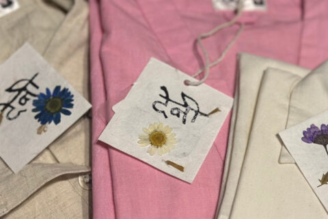
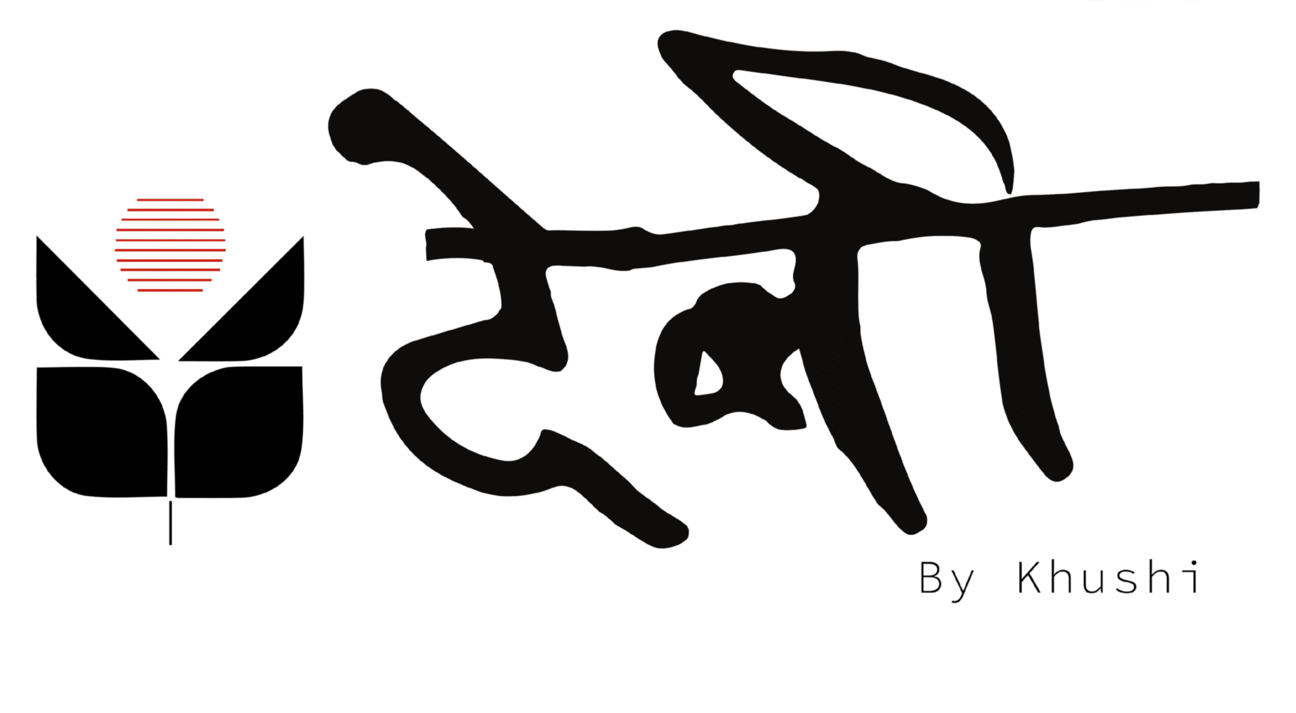
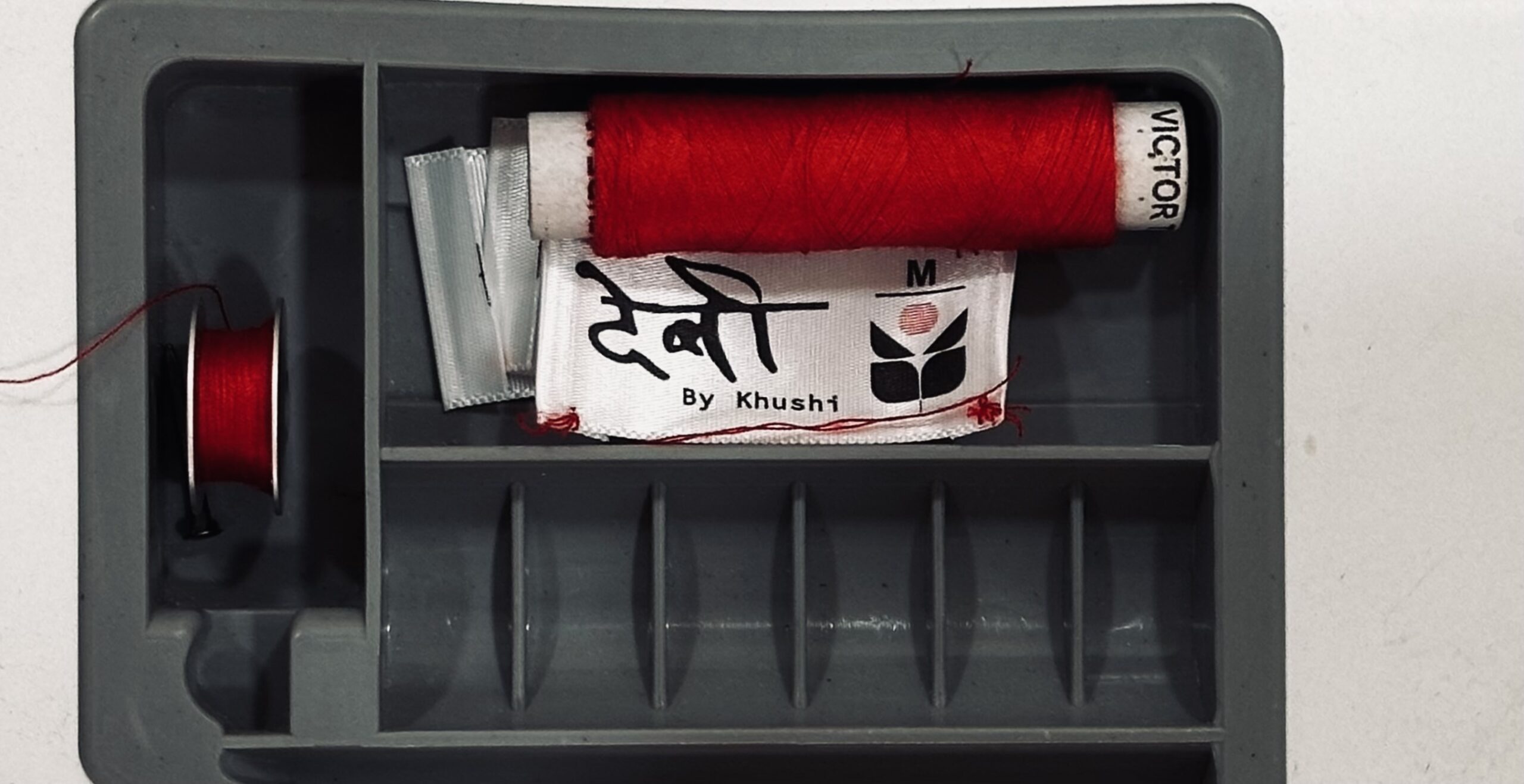
At the heart of this design lies something deeply personal—a handwritten signature. It once
belonged to my late grandfather, Shri Devishankar, a man whose journey was de ned by
persistence and purpose. His name, written in ink, was not just a mark of identity but a testament
to the life he built with resilience and integrity.
Inspired by that signature, we re ned its strokes and transformed it into an enduring visual
identity. Every curve and line carries the weight of its history, yet it now stands as a contemporary
symbol—one that re ects movement, authenticity, and a philosophy of meaningful creation.
A Design Rooted in Meaning
More than aesthetics, this emblem is an embodiment of thoughtfulness
- Fluid strokes represent evolution, the journey of continuous growth and re nement.
- Organic symmetry symbolises harmony with nature, mirroring a philosophy of mindful creation.
- A bold yet e ortless form balances tradition with modernity, much like the principles that
shape each of our designs.
Alongside the signature mark, an additional emblem enriches the narrative with its structured
symmetry and layered symbolism. At rst glance, its form is balanced and intentional—rooted in
stability, much like the values that guide every creation. Yet, when observed from di erent
perspectives, it reveals more. The bold, angular arrangement subtly mirrors the letter “D,” a quiet
homage to origins, while simultaneously unfolding into a geometric ower—a universal symbol of
growth, renewal, and evolution. Its precise symmetry re ects harmony between tradition and
modernity, where the past and the future coexist in e ortless balance. Above it, the red sun with
linear strokes represents rising energy and continuity, echoing the rhythm of nature and the
ceaseless journey of creation. This emblem is not just a design; it is a story told through form—
one that reminds us that meaning is shaped by how we choose to see it.
Beyond a Logo: A Lasting Impression
A logo is often the rst thing one notices, but its true value lies in what it represents. This emblem
is more than a design—it is a philosophy, a tribute, and a promise to create with purpose. It
re ects the principles that shape every silhouette, every fabric, and every choice made in the
process of creation.
A Story in Every Silhouette
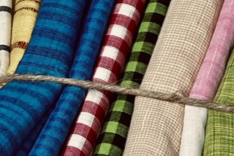
Fashion is not just about what we wear—it is about movement, identity, and the way we carry
ourselves. The silhouettes designed under this philosophy embrace uidity and e ortlessness,
echoing the grace of traditional forms while seamlessly tting into modern life.
With every stitch, every detail, and every creation, this mark stands as a quiet yet powerful
reminder—one that speaks of origins, evolution, and the beauty of designing with meaning